Insights through Data Analytics Reports
Dynamic Reports
When working with many Entities, Processes, Visualizations, etc., keeping a good overview cannot be easy. For many, colors are an effective way to maintain a clear overview. Therefore, Dragon1 offers the option to create dynamic reports to analyze the data stored.
Steps to create a Data Analytics Report
The dynamic report can be created in five easy steps:
- Go to the Collaboration Data Dashboard
- Click on one of the tiles, e.g., 'Application'
- Click on 'Report'
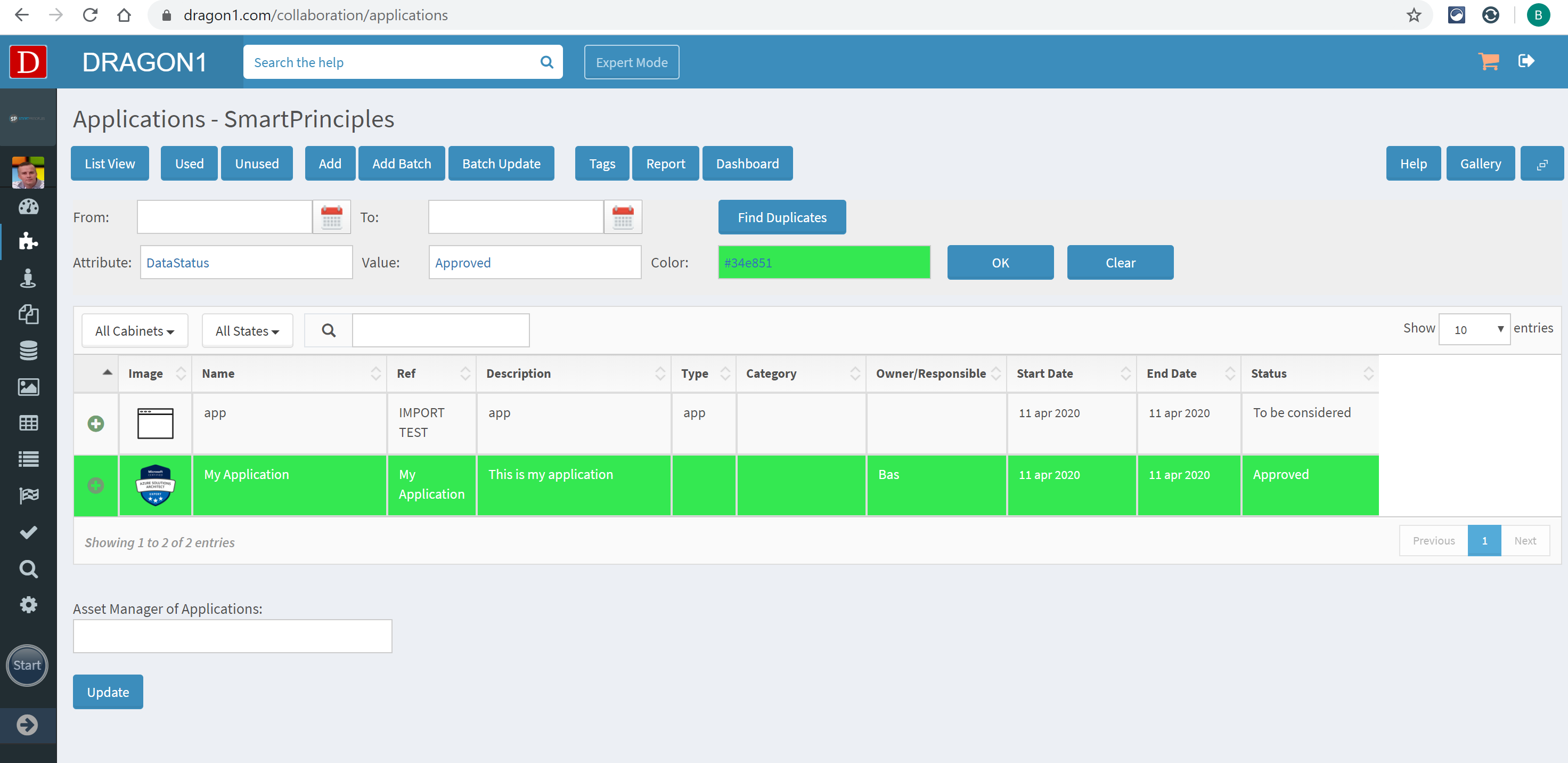
- Enter the name of an attribute (DataStatus) and a value (Approved)
- Select a report color and click 'OK'
The rows in the list will change color for the matching attribute.
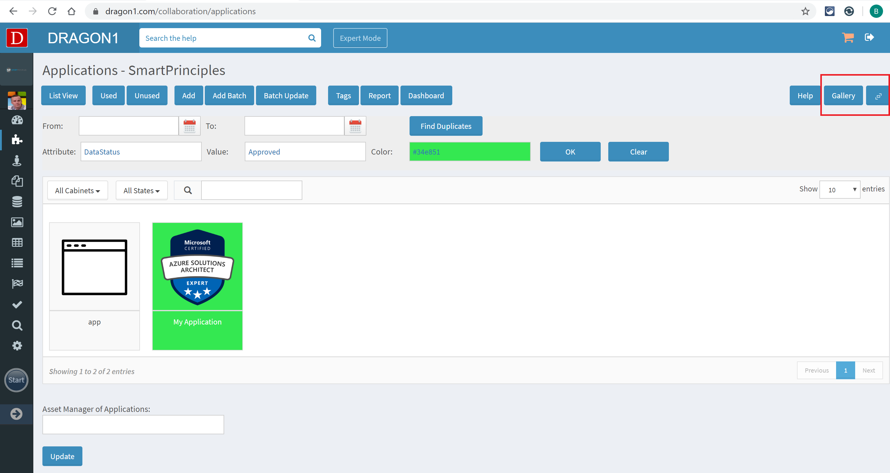
The data can be shown in a list or gallery view (with normal or large-sized tiles).
- Click the Gallery button (in the top left corner).
- Click the shape enlarge button (in the top left corner).
Tips and Tricks
Below are some tips and tricks to get more out of the dynamic Data Analytics Reports.
Tip #1: Multiple colors
In a list, multiple colors can be used simultaneously. This can be handy in case a report must be created on multiple attribute values.
Tip #2: Not all attributes
Currently, the report is supported by data attributes, such as 'DataStatus.' The DataStatus is the most commonly used attribute. Future versions of Dragon1 will support more data attributes for reporting.
Tip #3: Revert to normal
Reverting to a list without colored rows is as easy as leaving the list screen and returning to it (e.g., by opening one of the rows in the list).


