User Interface Basics
Learning Objectives
Here we will explain the user interface of the Visual Designer. This is the web application you will deal with most when you start with Dragon1.
In this lesson, you will learn the following:
- How to start the Visual Designer?
- What are the names of the various areas of the Visual Designer?
- How to change the Visual Designer's layout, look, and feel to suit your personal needs?
- Set the canvas to full screen
- Expand the Explorer
- Select a template
Startup Screen
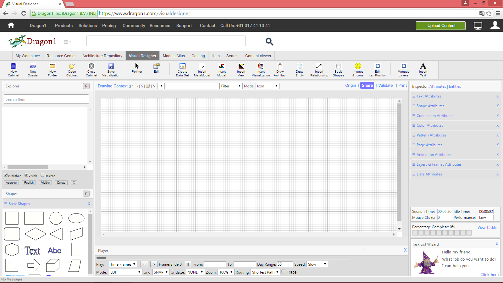
If you are logged in and start up the Visual Designer, your screen will look a lot like this:
Areas
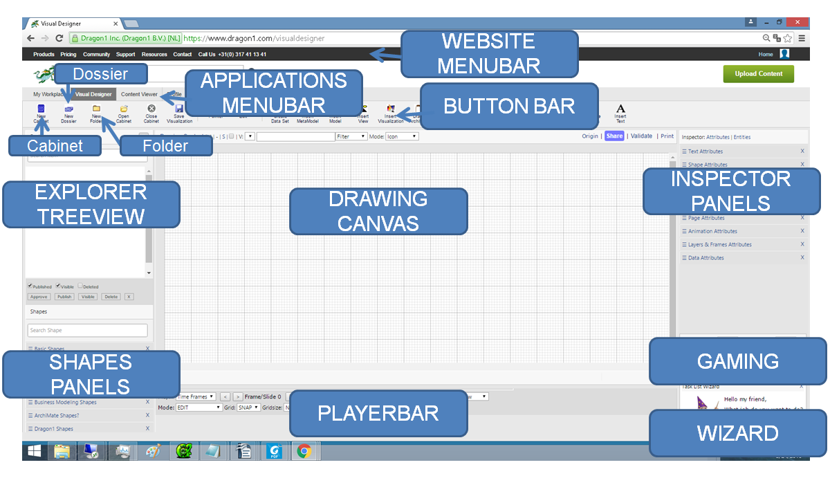
Throughout the Help pages, we consistently use names for the areas in the user interface. Below you'll see the area names for the Visual Designer.
Website Menubar
This menu bar lets you choose between the various parts of the platform. Click on an item to go to that part.
Application Menubar
This menu bar lets you choose between the various web applications of the platform. Click on an item to go to that part.
Button Bar
This menu bar lets you choose between the various functions of the Visual Designer. To choose a function, click on a button or do a mouseover on a button and click on an item in the dropdown menu of that button.
New Cabinet
To create a cabinet, click on the New Cabinet Button in the Button Bar.
New Dossier Button
To create a new dossier, click on the New Dossier Button in the Button Bar.
New Folder Button
To create a folder, click on the New Folder Button in the Button Bar.
Explorer Treeview
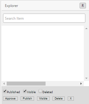
The Explorer Treeview shows the contents of an opened Cabinet. The Explorer Treeview gives you access to dossiers, folders, and items.
If you have access rights to certain items, you will see them. If you do not, you don't see them. An empty folder does not mean that there are no items.
Expand the Explorer Treeview
The Explorer Treeview is a tri-state control: Normal height, Double height, Zero height.
To expand the Explorer Treeview, click once on the word Explorer.
To collapse the Explorer Treeview, click twice on the word Explorer.
Visible and Delete
You can hide and delete items at the bottom of the Explorer Treeview. To hide an item, select an item and click on the visible button. Select an item and click the delete button to delete it.
Shapes Panels
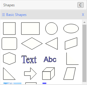
The Shapes Panels are collections of core shapes of a modeling language. The default languages provided are:
- Basic Shapes
- Flowchart
- Dragon1
- Logi
- UML
- BPMN
If you have selected a visualization or model, you can drag shapes from the shapes panels onto the Drawing Canvas.
Dragging means clicking on a shape. Holding down the mouse button. Moving the shape to the desired position and then letting go of the mouse button. The shape will be inserted into the model or visualization, and the model or visualization will be automatically saved.
Inspector Panels
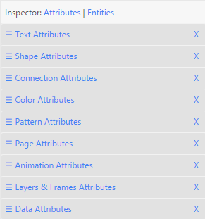
The Inspector Panels are panels with specialized attributes for shapes. There is a text panel, a shape panel, a color panel, and a data panel.
To change the title of a shape:
- Select a shape on the Drawing Canvas
- Click on the name 'Text Attributes' of an Inspector Panel
- Type a new title in the title field
- Press TAB
- Save the visualization by pressing the Save button in the Button Bar
Drawing Canvas
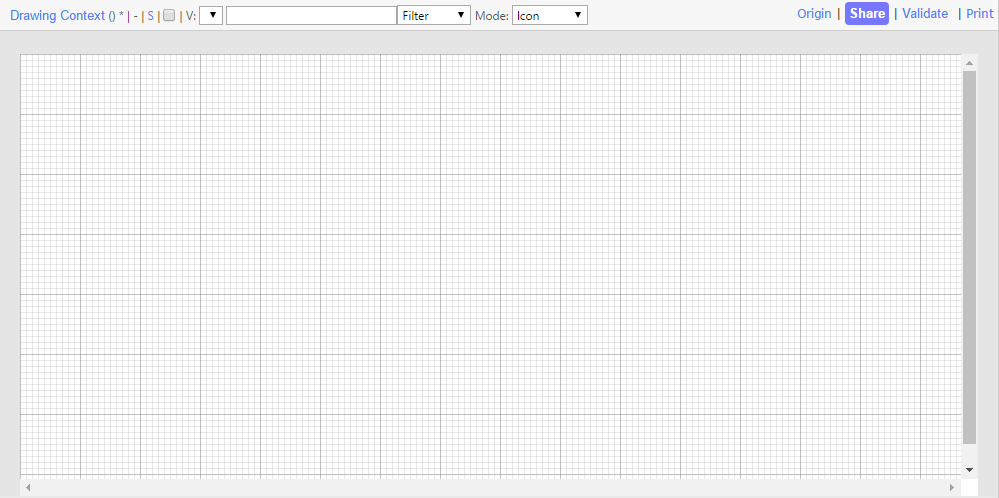
The Drawing Canvas is a sheet on which you draw shapes.
To draw shapes:
- Drag a shape from the shapes panel
- Click on a shape in the Insert Archifact or Insert Entity drop-down menu in the Button Bar
Player Bar
The Player Bar allows you to play a scenario and go to the next or previous time frame in a visualization. And some other basic functionality.
To make use of tracing in a model, switch to normal mode and click the trace checkbox
To make use of the pop-up feature, switch to Normal mode.
Resize the Canvas to Full Screen
To resize the Canvas to Full Screen in Edit Mode, click on the word Drawing Context in the title bar of the canvas.
To resize the Canvas for Presentation Mode, select Presentation Mode in the player bar.
Gaming Panel
The gaming panel measures how effective and efficient you work: in how much time and in how many clicks do you complete a tutorial?
To see how productive you are, look at the figures in the Gaming Panel.


